Emerson Woelffer: At the Center and At the Edge
February 1 – May 31, 2008
Opening reception: Friday, February 1, 6:00-8:00 p.m.
Curator’s talk at 7:00 p.m.
Free for BMCM+AC members / $3 non-members
For more information go to Black Mountain College
or click on my link to the right of your screen.
Friday, December 28, 2007
Monday, December 24, 2007
Typeface: Langdon Geometric
I'm on a new plan in designing my typeface. I'm going in the direction of Herbet Bayer of the Bauhaus by denouncing capitals and going completely geometric. I'm almost done a new draft of it. I'll post it when I'm done with that draft and scan it in. Langdon Geometic is the name of my typeface.
Max is going to review Helvetica sometime after Christmas. My friend Dustin who was a co-student of mine in design school wants to see it so we will watch that after Christmas too.
By the way, Merry Christmas!
Max is going to review Helvetica sometime after Christmas. My friend Dustin who was a co-student of mine in design school wants to see it so we will watch that after Christmas too.
By the way, Merry Christmas!
Tuesday, December 18, 2007
Helvetica: The Movie
I received my copy of Helvetica yesterday in the mail. My wife and I watched and I loved and surprisingly so did she! The cinematography was outstanding the interviews were engaging, funny, and informative. I loved it, It was really a beautiful film.

click to enlarge
Max Kath is going to be coming in time to time to review films and I have asked him if his first review will be Helvetica. He agrees. He is a 4 year major at Western Carolina for film studies and hopes to be making his first feature in the next couple of years. I've known this guy for pretty much all of my life and I'm pleased and honored to have him come on this blog to review films (what he does best). I'll be designing the posters as well as editing his films.
Monday, December 17, 2007
Horizontal Punctuation
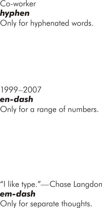
It has been brought to my attention that most novice designers do not know what a hyphen is correctly used for. Hyphens should only be used for connecting words such as co-worker or pickup-truck. They should not be used for dates or separate thoughts. An en dash is used for ranges such as dates, an em dash should be used to connect separate thoughts. Its critical for designers to use these punctuations correctly, especially when work is being sold to the public.

click to enlarge
click to enlarge
Friday, December 14, 2007
Typographical Routine
The reason why people with no design knowledge pick the type they do, is because they don't know any better. They've seen their school essays all been forced into Times New Roman 12pt. They see their sans-serif type all being forced in Arial 12pt . Its okay if you don't know to some point. Ignorance is bliss in some cases.
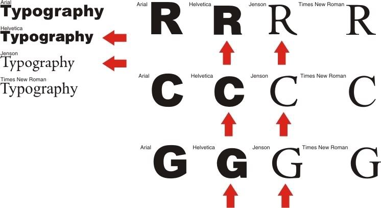
I'm getting worried when designers, sign shop owners, only use these bland routine typefaces. Times New Roman isn't horrible its just that there is so many other choices out there for more honorable serif typefaces. Jenson is only one of many great serif faces to choose from, but you can't go wrong with it. Designed by Nicolas Jenson in 1470, Jenson has been around for a while and has sustained the test of time to be one of the industries most widely used serif faces.
Arial on the other hand is complete crap! I've always hated it even before I was a designer. I just found that it was even cooler to hate it when I became a designer! Arial really does mimic and wanna be Max Meidinger's Helvetica. Helvetica has a love/hate relationship with today's designers I just happen to be one that loves it. Designed in 1957 it is considered a neo-grotesque typeface. Grotesques are known for their stagnant appearance and serious tone, due to very little of not no stroke contrast. Helvetica most definitely fits that category.
I just don't get how designers (not regular people) choose faces like Times New Roman and Arial to do sold work. When they could go the extra mile, pay the extra buck and get some good typefaces for outstanding work for our public to see.

click to enlarge
I'm getting worried when designers, sign shop owners, only use these bland routine typefaces. Times New Roman isn't horrible its just that there is so many other choices out there for more honorable serif typefaces. Jenson is only one of many great serif faces to choose from, but you can't go wrong with it. Designed by Nicolas Jenson in 1470, Jenson has been around for a while and has sustained the test of time to be one of the industries most widely used serif faces.
Arial on the other hand is complete crap! I've always hated it even before I was a designer. I just found that it was even cooler to hate it when I became a designer! Arial really does mimic and wanna be Max Meidinger's Helvetica. Helvetica has a love/hate relationship with today's designers I just happen to be one that loves it. Designed in 1957 it is considered a neo-grotesque typeface. Grotesques are known for their stagnant appearance and serious tone, due to very little of not no stroke contrast. Helvetica most definitely fits that category.
I just don't get how designers (not regular people) choose faces like Times New Roman and Arial to do sold work. When they could go the extra mile, pay the extra buck and get some good typefaces for outstanding work for our public to see.
click to enlarge
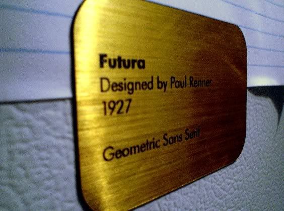
Futura + Refrigeration = No serifs, Perfect Circles, and Cold Milk
I made a few magnets to go on our refrigerator and thought why not typographically educational ones? I made one for Helvetica, Garamond, Bodoni, Baskerville, Futura and Avant Garde. I took a picture of the one on Futura they are all the same point size and layout.

click to enlarge
The only AIGA chapter close to Clyde is Knoxville. There is not to much is going going on there though, Charlotte is the next closest. I want to create a new chapter for Asheville, but as of right now I don't have the resources to do so. I'm going to research and find the small design firms around Asheville that would be interested.
I've started to try and design my first type face, Its really rough right now because I've only been through one draft for now. I'm looking to perfect it soon. It's geometric, with equal letter width as the cap heights, also with a low x-height. It may or may not work. I'm going to try and make it work and not change up my plan, I'm going try and stick to the equal letter widths with the height even if it does look like crap right now!

click to enlarge
Futura also makes your cake taste even better, and colder!
Try It!
click to enlarge
The only AIGA chapter close to Clyde is Knoxville. There is not to much is going going on there though, Charlotte is the next closest. I want to create a new chapter for Asheville, but as of right now I don't have the resources to do so. I'm going to research and find the small design firms around Asheville that would be interested.
I've started to try and design my first type face, Its really rough right now because I've only been through one draft for now. I'm looking to perfect it soon. It's geometric, with equal letter width as the cap heights, also with a low x-height. It may or may not work. I'm going to try and make it work and not change up my plan, I'm going try and stick to the equal letter widths with the height even if it does look like crap right now!

click to enlarge
Futura also makes your cake taste even better, and colder!
Try It!
I'm keeping this blog instead
Here is a post from that angel fire one from yesterday before I delete it!
Wednesday, 12 December 2007
Artist Refuge
Now Playing: Colors - BTBAM
Topic: Community
Okay, I watched Fully Awake the other day, the documentary on Black Mountain College. It got me thinking. I want to create some sort of refuge per say for artists of mixed media(design, type, art, painting, drawing, pen, photography, film, theatre if its artistic it goes), apartments or low cost housing with a large hall for working on whatever you wanted to work on, your rent would pay for your supplies and living cost. Every one has to be an artist of some sort and it would not be very demanding on how good you were per say the community would grow with time. Every year everyone needs to have a stopping point or final product to go in the annual mixed media art festival and in the annually published book. I want to create a chain reaction of art explosion. This will take time and money but it is a dream and all dreams start with a thought and become reality.
Thursday, December 13, 2007
First post just to see if I like this better
So far this has struck me as better just in the fact that I can type with out having to wait five seconds for my screen to catch up! another test is to see if I can edit and place HTML in my posts. I hate having to upload a photo every time I put it in a post, because I'm always having some design to show the public but I just don't' feel like uploading and resizing rather just using HTML. is fine by me from photo bucket. I don't care where it is I just want a blog to where I can post images and show my work for free (until I buy some space to get Chasography.com going)
- Test No. 1

did that show up as an image of a typographic monograph or just n ugly HTML tag? if it worked then click on the thumbnail to see it full screen!
- Test No. 2
definitely lost.... having better typeface choices than Arial, Verdana, and Times. boo! but maybe I can make my line lengths about 5 words like I want instead of full screen...
- Test No. 3
I'm going to search this in Google to see if it actually comes up.
Subscribe to:
Posts (Atom)

