click to enlarge This is the Chasography poster for the upcoming year of 2009. It is a bit of veer of my normal modernist style. I actually didn't use helvetica for this one! hah! I used ITC Kabel instead. I was really feeling a geometric typeface for this one and you can't go wrong with the classic Kabel!
click to enlarge This is also a poster for the upcoming year of 2009. I feel since we have Bush out of office that hopefully we will have a new and better ethic based on experience and utility rather than religion. I know this really isn't a new ethic but it is a change from the norm of America. Hopfully everyone will so the falsity of religion based morality.
There is an updated PDF of my portfolio ready to download! and plus I made a portfolio on coroflot, just click the link or the thumbnails in the speech bubble! Enjoy the new shit below!
click to enlarge
Above is a small logo for a new blog of mine. It is set in Akzidenz-Grotesk Condensed-Italic
click to enlarge
Do I need to explain this one? huh? goddammit!
click to enlarge
a quick prayer for those who love swiss modernism and wish to give their hearts to it!
This is what I think about our current situation with war. To be a fighting war machine you go through a decontruction and dehumination. This makes you a no fear nihilist. This is the only way to survive war. Esspecailly in this situation, no real reason to be there.
I've uploaded a updated portfolio. It has been long overdue. I've not really been doing much that took much of a thought process other than stuff that I've had a stable idea of execution. These are what results.
click to enlarge Above is a culture inspired logo repition for my roots music project The Zompire Brother.
click to enlarge Above is inspired by Vonnegut's The Sirens of Titan
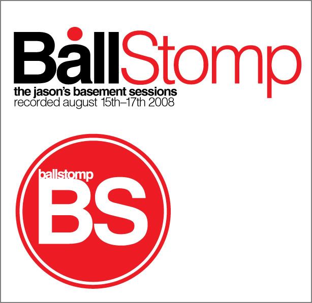
click to enlarge This is an idea for Ballstomp's second set of songs for a CD.
click to enlarge Above is a new logo for Ballstomp
click to enlarge Above is the flyer for the "in the works" Breakfest 2009
PIY stands for print it yourself which is a way I am going to destroy the no good designers of Western NC that charge out the yin yang for art charges. I will design what ever anyone wants for absolutely free, no art charges what so ever. I'll then give then a high resolution PDF to exact size to their specifications and then can take the file to the nearest print shop or copy center to have it printed. No capital for me to spend but my time, which is expendable at the time being. All work will still be under my copyright, but that's not the important part. I'm here to show people that they are spending too much for amateur bullshit. So sign shops around here charge up to 20 bucks an hour for art charges. All still come out with ugly amateur bullshit. 20 dollars an hour and you know it takes them forever to do it. Good design needs to be prominent, I am the Oil man for the design world. I wish no one else to succeed. I will smash those you confront me, because my service is free, you just have to print it yourself, easy as that. This won't pick up until later this year, mostly because I bought Chasography.com from some company and it won't be available for me to make this blog as Chasography.com
Here is some more little pieces I've been working on lately:
click to enlarge
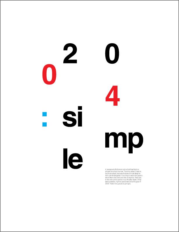
Above is a little piece about a time year in my life I would like to live over and over, the year of 2004. This was simple times, but it didn't seem so then. It seemed to be random and unorganized and hard to understand. But it actually had a simple grid like order, much like the layout of the piece. It seems random and disjointed, but is actually in much order.
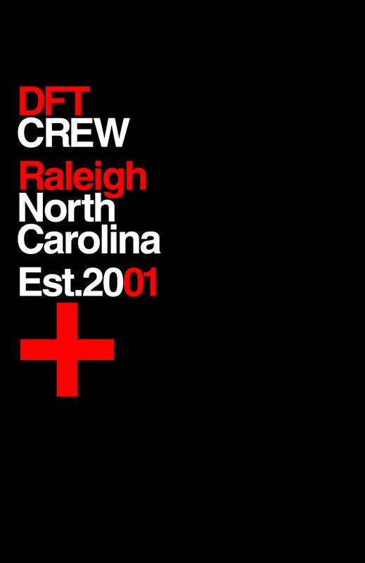
click to enlarge
Above is a hoodie idea that is long overdue. My band that was conceived and started around 2001. Dressed For Tragedy was a big part of my life, if not my entire life. The friends in the band plus the friends at shows deserve a hoodie for created the most fun and heartfelt times of my life. Again, I'll best year was 2004 when we actually played our first show, that is what fuels the first design, the simple times.
click to enlarge
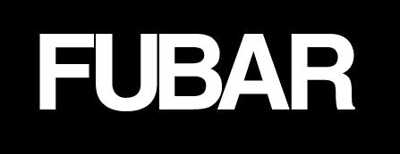
This is a simple shirt idea for those you think life is FUBAR and don't mind expressing it.
Its been awhile since I've cranked out some ideas. I helped design an album cover from Greg today and I've started some new blogs, but that is about it. I've been busy working my day job but I'll soon leave that job for another. A copy guy will be my new job. Not exactly a designer but at least I'll be around print work and get a discount on computer stuff and prints. I did this really fast for our background on our computer for Amber when she was down, it worked: it made her smile
click to enlarge
click to enlarge
I've changed to look of this blog, from red to cyan and I've designed a new logo. I needed a change for the new year so I don't have to be reminded how last year ended and why. The new look was for myself and the site, for both the same reasons. The site needed a pick me up and fresh new look and color scheme. I needed a pick me up and a fresh new feel to keep me going in the design field even though I was thrusted out of it by idiots. Change is neither bad nor good but inevitable.
My portfolio needs an update soon, It will happen and I shall post of it!
It seems that since the Helvetica movie has came out and Helvetica had its 50th last year. that hating Helvetica seems to be the in thing to do. Before that seems that people that used it, used it. Those who didn't, didn't.
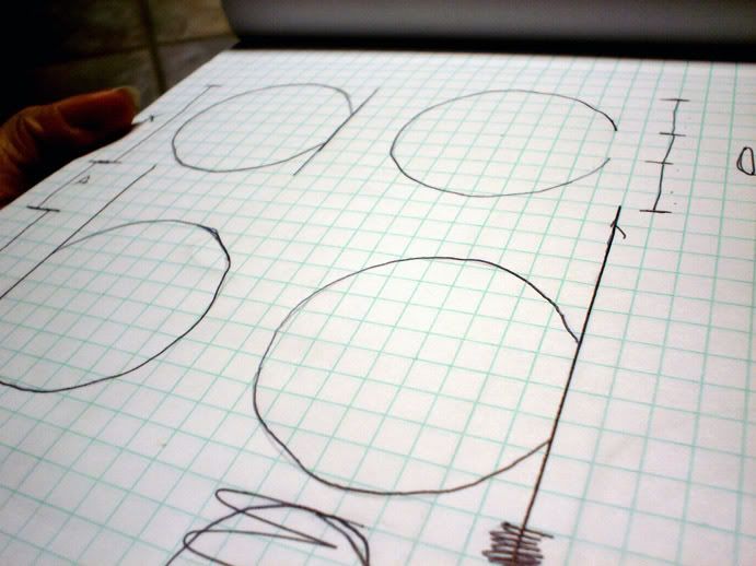
I started designing this over Christmas but once we lost our place it got lost in all the packed stuff. Well I found my grid pad and took some pictures of the rough sketches. I don't have any font making software but i think I may try and design the letter forms in Illustrator. It wouldn't be a font but at least it would be digital.
Identity, a word that has come up in the news a lot as of lately. It is who we are, our good name if you may. We here all these threats of identity theft and credit card fraud. These days the only thing keeping our name alive is being in possession of and I.D. card or S.S. card+number. Its rather scary that all we have is something that can be easily stolen.
In the design world identity has a similar but different meaning. Most people think of the word logo, which is a graphic or type copy written by a certain organization as their I.D. card or S.S. number. It is imperative for a company or organization to keep their logos safe from theft just as a person word keep is S.S. card safe or birth certificate.
The creation of logos is a stressful task. It is something I would not want to be the main focus of my career. But of course if I had to do it I would, I just would not want to do it everyday. Logos should be simple, concise, clean, legible, readable, accessible, and above all professional. coming to an agreement on the look of a logo takes hours even days of brainstorming, it is not something one can just whip up even if the end product is just a slash and and a dot. The sad part of it all is no one will even recognize or think of the work gone into make that slash and dot. The actually creation of the slash and dot could be very easy, but the going through so many ideas, brainstorming, proofs, and drawings is the stressful part. It is a big responsibility as a design to create an identity for an organization. I would be responsible for their sales and image through the logo I create. I don't know, maybe if I design my first real identity for an outside organization then I may fall in love with the process and the power. The power, it must feel really empowering if you design a great successful identity for a powerful and successful business. I wouldn't know, yet.
Enough with all this talk and I'll show you why I decided to make this post. While I was in design school one of our projects in design II was to create an identity for ourselves. The one I made was quite atrocious! It was a tracing of my head done in all black, white, and gray, White eyes, gray face, black hair and beard. It looked like a graffiti for some tyrant! Across the face, I had "Pile-On Booking" repeated in some sans serif. I had booked some hardcore punk shows under that name and wanted my logo to have something to do with it. Well, the bottom line is it didn't work.
The closest thing of a logo for myself would most likely be the header of this blog. It actually has gone through one change though the change will go unnoticed to the non designer. It started out set in Helvetica Black but I changed it recently to Helvetica Bold and the red is now a pure CMYK red. The bold is just a bit more readable and slick that the black.
Logo 1: click to enlarge
Logo 2: click to enlarge
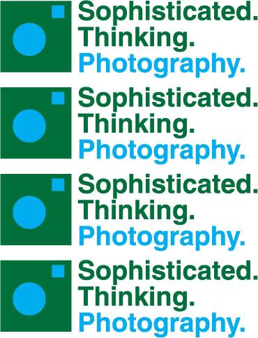
Below is a logo for my fiancee and her photography. The shapes make up a camera and the type reads any way you would like it to with the colors separating the actual name.
click to enlarge
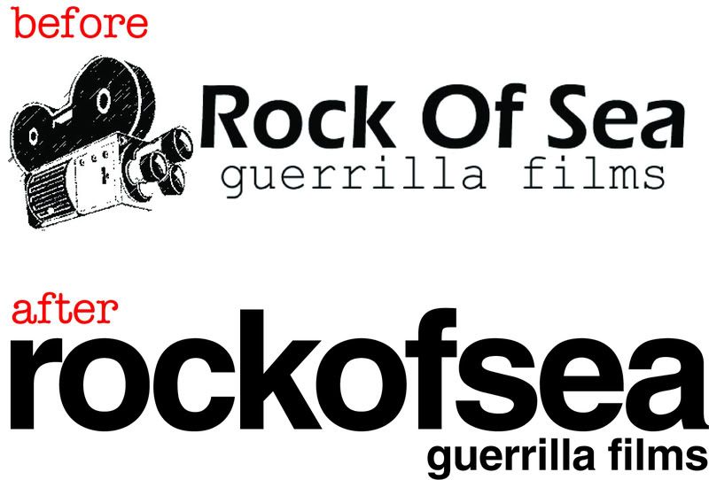
Below is a new identity for Rock Of Sea, which is Max Kath and I's film company we make short films under. The first is our old logo and the second is the fresh new one which has never been used yet.
click to enlarge
The first logo there wasn't the first logo for Rock Of Sea. The first logo wasn't really a logo, but a picture with bad type that flashed on the screen at the beginning of a couple of our films. It can be seen here in the 2003 short film "Remember?". Enjoy it below!
The other day at work, I was outside in the cold with my feet completely covered in water and my shoes completely filled with water cleaning up the garden center and building tables. I was pretty much by myself besides one of my managers working in the same area and helping. I had time to think and I thought about my views on this whole God ordeal and how I can design a specific view of mine.
I don't like bringing up religion in conversation on even the single fact that I am an atheist into conversation, just because I don't feel like being preached to and told how wrong I am and how I'm going to hell. On the topic, if I was to get into one of these topics I wouldn't want to embarrass anyone by debunking and completely schooling them in a debate on science versus myth, especially in a professional or work environment.
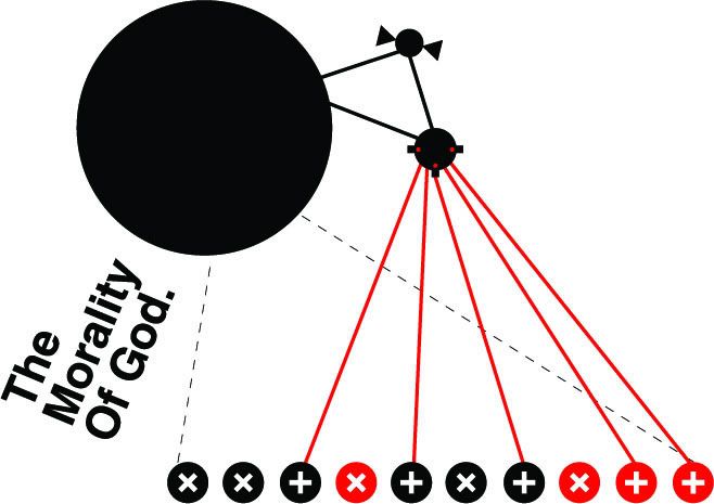
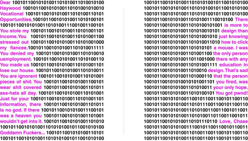
Below is a work in progress and is most definitely probably going to change before its officially added to my portfolio. It is called The Morality Of God, as noted in the type. It is a modern piece and using only geometric shapes I illustrated a scenario that baffles me about Christianity and how this idea is considered moral and just. I am not going to go into explaining everything the details about this piece here but if you would like to know then ask. I will be happy to explain it to you. I will only go into this when it is wanted to be heard. Other than that, enjoy the piece.
I'm coming to a maybe temporary idea of what I will take on the design and/or work world. I don't want to work for another design workplace for long time. I want to take on the look of the town on my own with freelancing and hoping to further my success from there and one day start my own studio. Working for someone designing at least around here is a nightmare, I need design to be second and work be first. I need money to take care of my family, and I don't need to worry about losing my job over something stupid. I'll design like I want to with the training and constrictions of my past education. I don't want to have to worry about an uneducated schmuck telling me what I can and can't do. Working a day job and design of night is what I'm going to do. I want to have some exhibitions and zines out. Speaking of publishing, I'm writing a book and hopefully it will get published. I will of course design my own cover and page layout. If it does get published, you can buy it on this site.
One can get away with a bad type choice if their layout ends up being awesome. The key word to that sentence is can; it can work, not it will work. I don't think any layout would mend the horrors of Papyrus or Comic Sans. Typefaces like Arial or Gill Sans are two typefaces that can work if using a killer layout. But you have to think if someone could think of a great layout would they know about the type they are using? I know that some people may have an inner knack with eye pleasing layout but either only have the typefaces that came on their computer. I'm not sure what the problem is but we may be able to look past a horrid typeface choice if the layout is great, but of course it would be much better with a firm typeface choice.
On the other hand bad layout will not look great even if using Futura or Helvetica. Type gurus will see the design and all they will get out of it is the fact that they can say, "Hey, that's Futura." but it doesn't go any further than that. I've seen Helvetica used in the most horrible ways even though I love the typeface I can't get across the bad design esthetics and most likely bad kerning, leading, or tracking. These designs were probably done when Helvetica was a default on PC and if those same designers did that design today they would use Arial or Tahoma.
Good designers, please watch the type you use to push your designs to an extra level. Bad designers, please stop centering everything; kern once and a while. Oh, and kerning and tracking are not the same thing.
I am sure there are still mistakes and typos. Let me know any critiques and proofreading as you like. The more honest the better! Please note that the best way to view is by downloading it from your browser. If you don't have Adobe Reader you can get it here.
My portfolio is done all but being proofread a third time. I am going to make sure this one is nearly perfect. Once I get a new job I am buying some new typefaces that my computer lacks such as Helvetica and Futura in various weights. I'm ready for Linotype to finish their Windows version of the FontXplorer or I can just save up and get a Mac that would be ideal but money is a very big deal of course.
HVO denied my unemployment, which is completely bogus. I am now frantic to find a new job and knowing that I will not be compensated for my off time makes me sick to my stomach. I have a promises meeting with an employer on Tuesday. They have my resume and I will be getting them my portfolio once it’s done, as you all know it is still under construction. Wish me luck!
Gill Sans seems to be everywhere. I'm not sure why its not the greatest typeface ever. I am actually not a fan of any humanist. If I want stroke contrast then I'll just use a serif typeface. Go grotesque its chic!
I feel that freelance work beats most design school students work that graduate. I'm not sure what the statistics are though I have a hunch. Freelancers have this power, this spirit for design that some of the grads that just want a job in a high pay field. I'm sure there are cases that freelancers do not know a lot of knowledge that design school can teach but once they have it the world is in their hands. But a devoted freelance designer most likely researches his own path for design and design aesthetics. I don't have a degree but I went to school enough to know how to use programs but I already had a fire for design. While in school it was hard to research and do your own work because you have so much school work to do and when not doing that you are working it becomes tough to find who you are as a designer.
DESIGN MORE RESEARCH MORE KNOWLEDGE IS POWER LEARN EVERYTHING YOU CAN DESIGN MORE DESIGN ALL THE TIME
If there is any jobs out there looking for a new talented designer with new ideas, feel free to email me at chaselangdon@hotmail.com
I'm always up for input and constructive criticism, feel free to comment at any time. Please try and keep professional please! We are designers not children, keep it in good taste!
And remember, If anyone needs something designed for a cheap price, fliers, posters anything! let me know I'm always up for a challenge!
My portfolio is under construction for the time being to fix a lot of mistakes because to be quite honest that portfolio was thrown together in one night for an interview the next day. I do not condone this type of procrastination or laziness but it happened and all I can do is just move on and make it better. Most of the work in my portfolio was work from school, except for a few designs that were done freelance. I'm not working hard trying to perfect it maybe even starting over from scratch to make my portfolio more readable and accessible. Thank you for understating.
Here are is a couple of projects I'm currently working on.
click to enlarge
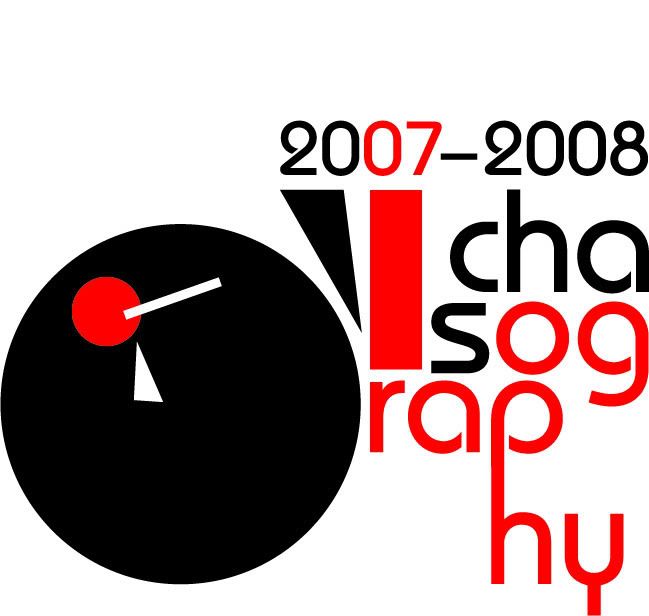
Above is a poster idea for Chasography. It will be 33x24 landscape orientation. I tried to illustrate this almost random or experimental yet still in order feel of Chasography. I have been designing using a grid and not point sizes as of lately. I never use fonts anymore, I type out my copy and then convert to outline as soon as I'm sure there are not typos(in which is almost suicide for me ha ha) I then size by grid to get my aligning in perfect harmony but yet still asymmetrical. It gives an ode to the constructivist era.
click to enlarge
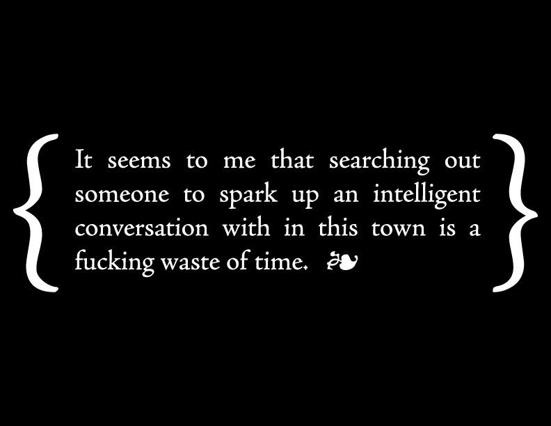
Above is a shirt idea for my screen print line. The background on this is that living in a rural town sometime really sucks, and all we want to do is get out an get to somewhere that's more got more to offer, with me its design. I just want to find a place to where I'm not going to get fired for having ambition for the design world and having a blog and portfolio for those to see that would be interested in it. So, I better not search out a good conversation, its all a waste of time!
Since I've been home a lot aside for going to employment and job searching, I've been working on some freelance designs.
click to enlarge
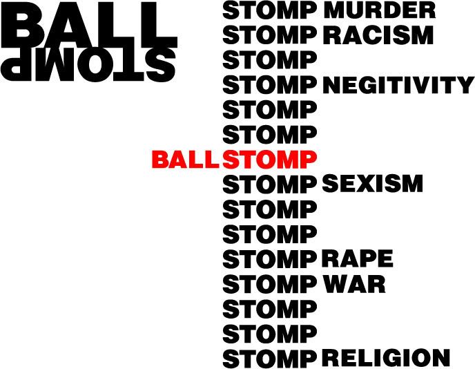
Above is a shirt of hoodie design for my current hardcore punk project, Ballstomp. To the left is the logo that would be screen printed just above the left breast and the to the right is what would be large across the back.
click to enlarge
click to enlarge
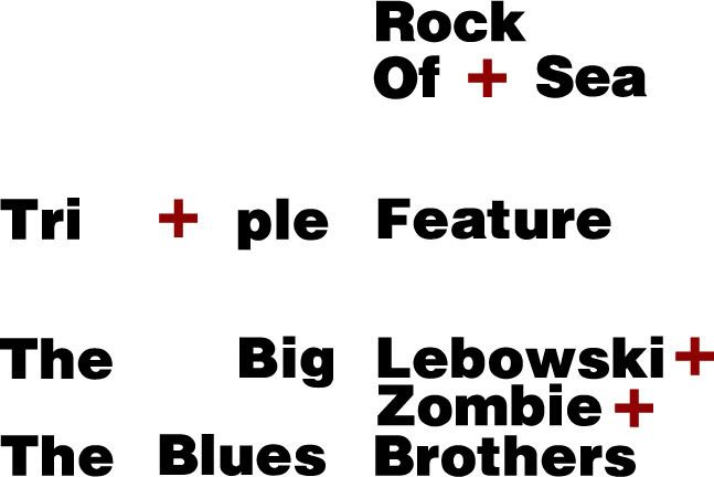
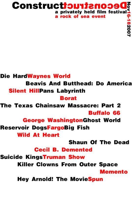
Above are two flyers for small film fests we had and are going to have. The first flyer is of a film night that Max, his girlfriend Collen, My fiancee Amber, and me are having once Max and Coleen return from Raleigh. The second flyer is one we had in November. We have these little "film fests" often. Rock of Sea is Max and I's film company. We have been writing and filming short films for years now and hope to continue this into a career one day. We hope to be hosting small film fests within the year.
click to enlarge
Above is a shirt idea for my line of screen prints. It is a "western yin yang." My western yin yang is two crosses, one is right side up and the other is upside down. to signify the symbols of good and evil of western culture. If you wear this shirt you can show off your acceptance of good and evil working together in unity or nirvana. while using a western culture friendly cross. Typeset in Bauhaus medium, in all lower case to also give salute to Herbert Bayer and his universal typeface featuring only lower case letters.
Maturity and design go hand in hand. Graphic designers and looked upon as professional problem solvers. With high pay comes high responsibility and with responsibility comes maturity. Mature adults look for rational and simple ways to solve problems well as design projects. The best answer to design question is usually the simplest, but may undergo countless hours of proofs and editions to get to that design nirvana or gestalt. In life we are trampled on with many problems that require a clear, non-hostile approach in problem solving. Attacking some one's personal life with childish accusations in a professional setting is very immature and in my opinion is screaming "fire me! fire me!" As design professionals we should choose our words wisely and not attacking someone you have no idea what they are capable of. I have had to learn to choose my words wisely even in the most subtle of settings.