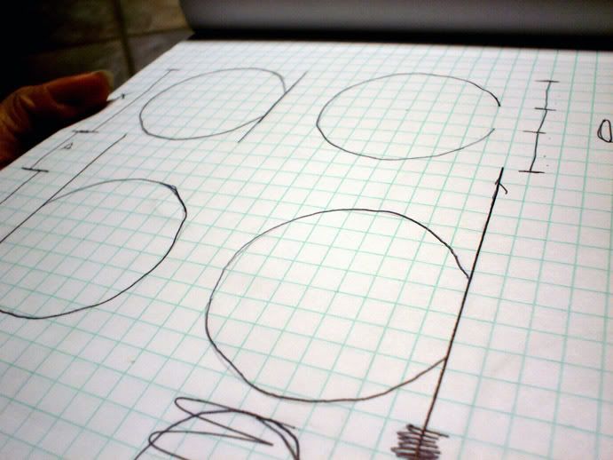
I started designing this over Christmas but once we lost our place it got lost in all the packed stuff. Well I found my grid pad and took some pictures of the rough sketches. I don't have any font making software but i think I may try and design the letter forms in Illustrator. It wouldn't be a font but at least it would be digital.
Identity, a word that has come up in the news a lot as of lately. It is who we are, our good name if you may. We here all these threats of identity theft and credit card fraud. These days the only thing keeping our name alive is being in possession of and I.D. card or S.S. card+number. Its rather scary that all we have is something that can be easily stolen.
In the design world identity has a similar but different meaning. Most people think of the word logo, which is a graphic or type copy written by a certain organization as their I.D. card or S.S. number. It is imperative for a company or organization to keep their logos safe from theft just as a person word keep is S.S. card safe or birth certificate.
The creation of logos is a stressful task. It is something I would not want to be the main focus of my career. But of course if I had to do it I would, I just would not want to do it everyday. Logos should be simple, concise, clean, legible, readable, accessible, and above all professional. coming to an agreement on the look of a logo takes hours even days of brainstorming, it is not something one can just whip up even if the end product is just a slash and and a dot. The sad part of it all is no one will even recognize or think of the work gone into make that slash and dot. The actually creation of the slash and dot could be very easy, but the going through so many ideas, brainstorming, proofs, and drawings is the stressful part. It is a big responsibility as a design to create an identity for an organization. I would be responsible for their sales and image through the logo I create. I don't know, maybe if I design my first real identity for an outside organization then I may fall in love with the process and the power. The power, it must feel really empowering if you design a great successful identity for a powerful and successful business. I wouldn't know, yet.
Enough with all this talk and I'll show you why I decided to make this post. While I was in design school one of our projects in design II was to create an identity for ourselves. The one I made was quite atrocious! It was a tracing of my head done in all black, white, and gray, White eyes, gray face, black hair and beard. It looked like a graffiti for some tyrant! Across the face, I had "Pile-On Booking" repeated in some sans serif. I had booked some hardcore punk shows under that name and wanted my logo to have something to do with it. Well, the bottom line is it didn't work.
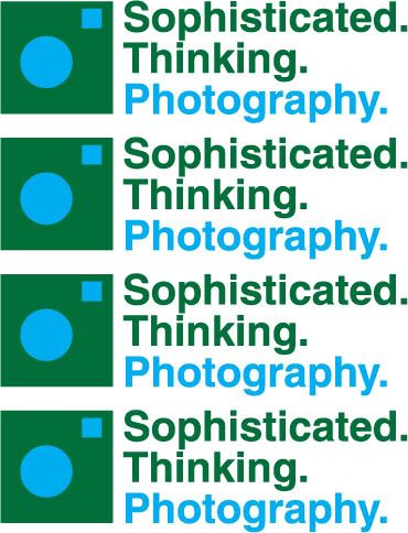
The closest thing of a logo for myself would most likely be the header of this blog. It actually has gone through one change though the change will go unnoticed to the non designer. It started out set in Helvetica Black but I changed it recently to Helvetica Bold and the red is now a pure CMYK red. The bold is just a bit more readable and slick that the black.
Logo 1: click to enlarge
Logo 2: click to enlarge
Below is a logo for my fiancee and her photography. The shapes make up a camera and the type reads any way you would like it to with the colors separating the actual name.
click to enlarge
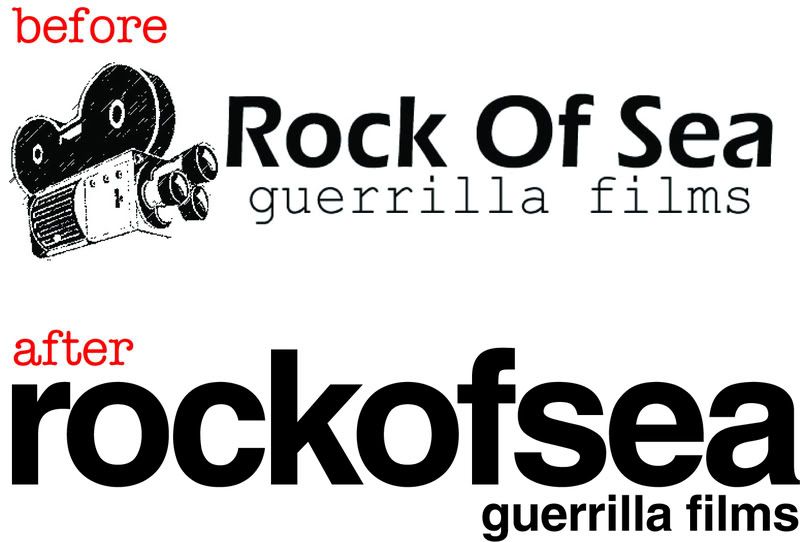
Below is a new identity for Rock Of Sea, which is Max Kath and I's film company we make short films under. The first is our old logo and the second is the fresh new one which has never been used yet.
click to enlarge
The first logo there wasn't the first logo for Rock Of Sea. The first logo wasn't really a logo, but a picture with bad type that flashed on the screen at the beginning of a couple of our films. It can be seen here in the 2003 short film "Remember?". Enjoy it below!
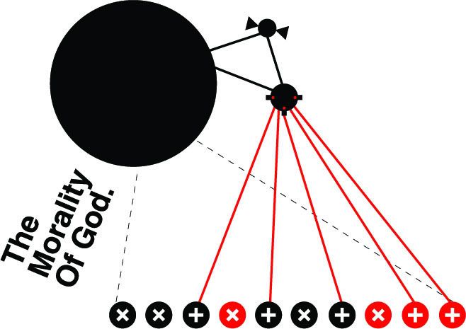
The other day at work, I was outside in the cold with my feet completely covered in water and my shoes completely filled with water cleaning up the garden center and building tables. I was pretty much by myself besides one of my managers working in the same area and helping. I had time to think and I thought about my views on this whole God ordeal and how I can design a specific view of mine.
I don't like bringing up religion in conversation on even the single fact that I am an atheist into conversation, just because I don't feel like being preached to and told how wrong I am and how I'm going to hell. On the topic, if I was to get into one of these topics I wouldn't want to embarrass anyone by debunking and completely schooling them in a debate on science versus myth, especially in a professional or work environment.
Below is a work in progress and is most definitely probably going to change before its officially added to my portfolio. It is called The Morality Of God, as noted in the type. It is a modern piece and using only geometric shapes I illustrated a scenario that baffles me about Christianity and how this idea is considered moral and just. I am not going to go into explaining everything the details about this piece here but if you would like to know then ask. I will be happy to explain it to you. I will only go into this when it is wanted to be heard. Other than that, enjoy the piece.